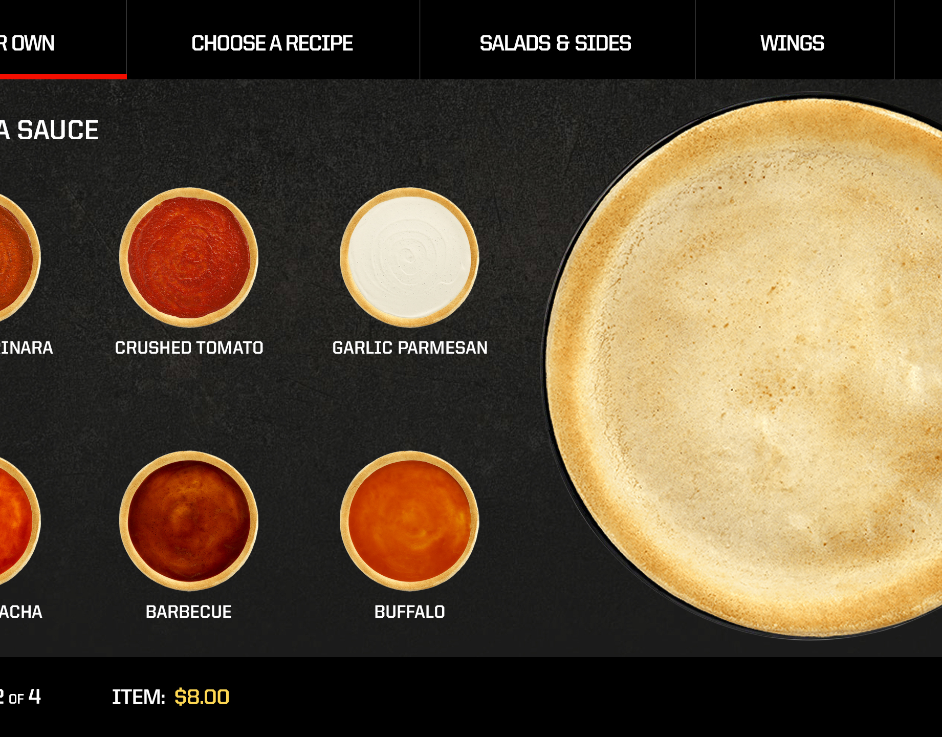
The goal of this project was to create an MVP for digital dine-in ordering for an updated store design. This was a test program in one store in Irvine, CA. The team worked off of the success of Taco Bell's mobile app and created an application with the maximum amount of customization and quick add to order actions.
"The restaurants, designed in partnership with IDEO and Mobiquity, aren’t just cool and interactive; they’re meant to encourage users to customize their orders in near-limitless combinations."
—Jonathan Ringen, Fast Company
—Jonathan Ringen, Fast Company
As the Sr. User Experience Architect on the project, I created four UX concepts for browsing the menu. Peekaboo (above) was chosen, once installed in-store, I worked with the Taco Bell team to observe users to iterate and maximize the design. The team worked in an agile design and development process to move from 3.5 food items shown to 5.5. Below are the other concepts not chosen for implementation.
The Customization screen went through many iterations, from a 4 step process, to 2 step process within the same screen, ultimately the deciding factor was to get all of the 'What's Included' ingredients as well as the 'Additional Toppings' on the same screen. As well as the contextual modifiers: 'Make it Fresco, Make it Supreme, or Get it Grilled'. Understanding the business rules of the menu was one of the most interesting parts of the project.
I collaborated closely with Senior Visual Designers, Project Manager, Tech Leads, Senior Developers, and a Delivery Director to ensure a successful project and happy client.
Creative Director: Todd Kamps
Sr. Visual Designer: Zack Dzanko
Sr. Visual Designer: Braylan Gray
Agency: Mobiquity
Sr. Visual Designer: Zack Dzanko
Sr. Visual Designer: Braylan Gray
Agency: Mobiquity
